Front Cover
This is my first fully constructed front cover for my magazine, Indigo. I am really happy with how my first cover has turned out and I think it is interesting and exciting. The 3 colour palette is really eye catching and creates intrigue.
I have been using Adobe Photoshop CS4 to construct the front cover. Below are my following stages and tools I have used to create my front cover.
I uploaded the image to Photoshop CS4 and used the text tool to insert my masthead, INDIGO and the move tool.
I again used the text tool to insert the sky line and the banner '300 UK GIGS LISTED THIS MONTH'. I used the rectangle tool to create the right banner which overlaps the skyline and masthead, I rotated it, shaped it and coloured it black using the fill tool, and changed the text to white. This makes it stand out and makes the text readable.
I created the circle through the rectangle tool, then I chose the ellipsis shape. I coloured the border in hot pink and deleted the centre so it is the colour of the background of the main image.
I sectioned the bottom part of the page off onto another layer to work out where I am going to place my other sell line, puff, and barcode. It is slanted as my text is going to be distorted and this will add variation to my cover.
For the text at the bottom of the page I rasterized then distorted the text for the sell line 'the 50 DARKEST ALBUMS EVER MADE...' then coloured the text white. I inserted a line using the line tool and coloured it pink and also did this for the smaller lines separating the artists. Then used the text tool to write out the puff and coloured it white.
I inserted the barcode and rotated it so it fitted into the right hand side of the page.
This is my finished first draft of my front cover. I've used the text tool to write inside the pink circle then rotated the text so it fits perfectly inside. and used this tool to create the rest of the sell lines.
However to improve my product I need to change a few details. In my second draft of my front cover I need to change and modify a few different aspects; I need to introduce one or two extra fronts to create more interest and variation for the magazine.
I will also enlarge part of the main sell line 'EXCLUSIVE VICKY P' to make it stand out more dominantly.
I also need to add a price (£2.00) and Issue No (46) to my magazine. I will place this above the bar code or underneath the masthead.
Front Cover Photoshoot - Analysis of Different Shots
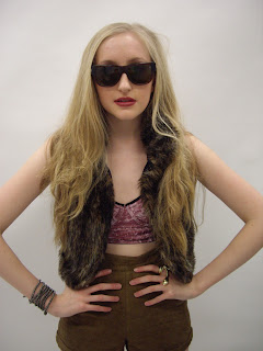
She is wearing in trend clothes that signify the indie rock genre and are very in-trend. There is plenty of room around the image to fit my text (masthead, sell lines, cover lines, puffs, etc)
Below are other shots from my photoshoot:
Below are other shots from my photoshoot:
I really like this close up shot, however it doesn't showcase enough of the costume to be featured on my front cover; and the costume partly attracts my target audience.
I haven't chosen this shot because it doesn't reinforce the artists confidence which wouldn't abide to my genre conventions. It also wouldn't stand out on the front cover as much as the image I have chosen.
This image is most things I was aiming for in a front cover image. However her body language doesn't connote full confidence which I was aiming for.
This is why I haven't chosen this image.


No comments:
Post a Comment