Friday 25 March 2011

Evaluation Question 2

How does my media product represent particular social groups?

From my secondary audience research I was aiming to represent Hipster and Indie and used the uktribes.com website to get inspriation. People that belong to these tribes are educated and usually have plently of money to spend on materialistic goods they desire such as smart phones, the lastest gadgets and designer clothes to make sure they are a cut above the rest. Being superior is important to them. They are also very interested in fashion and wear on-trend clothes.


This manifested itself in my production as;


My model is wearing very on trend clothes and accessories, and keeping up with the latest season is a big part of my chosen social groups life. Image is very important to them and they enjoy materialistic products. My model is wearing clothes similar to the models in my opening video.
She has long hair which is slightly backcombed to give volume, this style is common on most indie hipster models/artists. Her pose is iconic, she is a leader for this social group - the models in my video were all showcasing innovative poses which arouse interest. My image is in high-key lighting, taken in a studio and this is seen in most magazines of this genre.


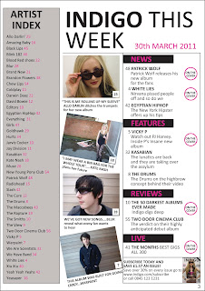
The four models on my Contents Page are all dressed in on-trend clothing and statement acessories (sunglasses), these clothes are commonly seen on 'indie, hipster kids'. They fit the genre stereotype whilst also challenging it in ways to realistically represent musical artists, for example my model featured in the 3rd photo down, is just wearing a simple plain t-shirt however this works for him as an artist. The images are taken in a variety of locations, these are all rural and unique, typical of the genre.


My model featured on my Double Page Spread is wearing very on trend clothes and the tights are very unique and make a bold statement. She has got heavy eye make-up on, which is common in models/artists of this genre. Her pose oozes confidence and reinforces that she is very sure of herself as an artist, we can see this with many musical artists in magazines of this genre.

Also the quotes featured on the article represent my social group as they are the sort of people that would be interested in this information and these would draw them into reading the rest of the article.

Wednesday 23 March 2011

Monday 14 March 2011

Pitch Analysis


Above are the comments my peer group and teacher gave on my magazine pitch. I am going to use these comments to improve and further devleop my product.

Sunday 13 March 2011

Double Page Spread Construction and Shoot Analysis


Firstly I uploaded the photo to Adobe InDesign. I inserted a dotted line to split the page in half to help me when I construct it to keep the page ordered and symmetrical. 


This image appears to be my finished DPS spread, however I didn't think the block of text looked professional enough and the title wasn't the size I wanted so I carried on making futher amends. I reached this stage by; for the title I inserted the text using the text tool and changed the 'without' to italics. I used this method to create the quote on the left side of the page. I created the transparent box by firstly creating a box with rectangle tool, droppping in a grey tint then applying a transparency to it. I then inserted the text using the text tool then fitted it to the size of the box. 


In this screenshot I have separated the article into two columns to create a more professional look that adheres to the genre conventions. I have made the title text larger to make more of an impact and to catch the readers eye. I added a pink arrow to signify that the text carries on onto the next page - When I first wrote my article it was much longer than this, however I had to cut it short to fit onto this page. I created the triangle from the polygon tool. I selected the polygon tool and before I let go of the shape I pressed the down arrow key to 2 times to create the triangle.

This is my completed DPS spread. I again inserted my quote on the left hand side of the page.  I have removed the dotted line separating the two pages as it was just used to help me construct my page. 

Shoot Analysis of Different Shots


I chose this shot for my DPS because my model is on the left hand side and looking directly at the camera so the reader will see her straight away and be pulled into the article. Her facial expressions and body language further reinforce her undeniable confidence she has in herself and her music. The background is very edgy and creates interest as it far away from mainstream-pop studio photos.
She is wearing in trend clothes that signify the indie rock genre and are very in-trend.


I didn't chose this image as the model is not looking at the camera therefore not making direct address with the reader.


I didn't chose this photo because it is quite closed framed and doesn't have much room for text, however I might also feature a smaller version of this photo on my DPS spread when I make amends.


I didn't chose this image because of the text on the right hand side as this would intervene with the article text

I didn't chose this photo as the main image for my DPS because it is a landscape close up shot and doesn't allow enough room for text. However I might also feature this photo on my DPS spread when I make amends; the floral in-trend jacket is typical of the indie genre and will draw readers into the article, it is also a good contrast against the black/grey backdrop photo.


I really like this image and it would have been the perfect image to fit on one side of the DPS, however in my intial planning I wanted a photo that was landsape to fill two pages. She is wearing in trend clothes that signify the indie rock genre and are very in-trend.