Saturday 19 February 2011

Contents Page Construction and Shoot Analysis

Contents Page


This is my first fully constructed contents page for my magazine, Indigo. I have used Adobe In Design CS4 to construct the page. Below are my following stages and tools I have used to create my front cover. 


I used the Rectangle tool to create the columns, I then used the text tool to fill in the Band Index, the heading and date. I again used the Rectangle tool to create the table of contents heading boxes and filled them in black.


In this screenshot I have used to the text tool to write in the headings in the table of contents and started writing in the articles and relevant page numbers. I used the line tool to create the black line separating the main heading from the table of contents the the second column.


I have used the text tool to write in the rest of the information for the table of contents.


In this screenshot I have finished filling in all the text in the table of contents. I used the line tool to draw a line under 'LIVE' to create a section for my subscription information. I re-sized the photos using Photoshop CS4 and I imported the photos into In Design using the Rectangle Frame tool, then rotated them to how I wanted them positioned.

Here I have used the text tool to insert the captions for the images, I then rotated them the text to suit. For the page numbers overlapping the image I used the rectangle tool to create the boxes then coloured them white and used black for the numbers.

This is my finished first draft of my contents page. It has been thoroughly thought out and I think it definitely resembles one of a professional magazine.

To further improve my contents page I may need to introduce another font type. And possibly drag down the band index and the table of contents columns so they fit the whole page.

Shoot Analysis

The shoots went really well and all to plan. And have chosen these four photographs because they are all different and add variation to the contents page. They all adhere to my genre conventions and will attract my target audience. For the costume they're all wearing in-season clothes and accessories typical of the indie rock genre. 
Below are some of the shots from the shoots I chose not to use for my contents page;


I really like this photograph as the models eyeline falls on the top third and as a result it creates direct address with the reader. The only reason I didn't choose this to feature on the contents page is that it doesn't showcase enough of the outfit, and costume is very important in my magazine genre.


There are lots of great aspects of this photo; especially the edgy combination of backgrounds. Nevertheless I didn't choose to use it as it doesn't create direct address with the viewer.


I really like this photo and it fits all the conventions of what I wanted for my contents page. However I didn't use it as it doesn't showcase enough of the costume.


I really like this photo as it showcases the in-style costume typical of the genre of my magazine however the image isn't landscape so it wouldn't fit with my contents page design.


I chose not to use this photo as it isn't landscape and wouldn't fit with my contents page design.


I really like this photo and I think it would fit really well onto the contents page, however the photo that I chose to use of this model is much more suited as it showcases a lot more personality and adds a mysterious edge to the artist. Also you can partly see her eyes on the other photo and this creates address with the reader.

Tuesday 15 February 2011

Front Cover Construction and Photoshoot Analysis

Front Cover


This is my first fully constructed front cover for my magazine, Indigo. I am really happy with how my first cover has turned out and I think it is interesting and exciting. The 3 colour palette is really eye catching and creates intrigue. 
I have been using Adobe Photoshop CS4 to construct the front cover. Below are my following stages and tools I have used to create my front cover. 


I uploaded the image to Photoshop CS4 and used the text tool to insert my masthead, INDIGO and the move tool. 


I again used the text tool to insert the sky line and the banner '300 UK GIGS LISTED THIS MONTH'. I used the rectangle tool to create the right banner which overlaps the skyline and masthead, I rotated it, shaped it and coloured it black using the fill tool, and changed the text to white. This makes it stand out and makes the text readable. 
I created the circle through the rectangle tool, then I chose the ellipsis shape. I coloured the border in hot pink and deleted the centre so it is the colour of the background of the main image. 

I sectioned the bottom part of the page off onto another layer to work out where I am going to place my other sell line, puff, and barcode. It is slanted as my text is going to be distorted and this will add variation to my cover. 


For the text at the bottom of the page I rasterized then distorted the text for the sell line 'the 50 DARKEST ALBUMS EVER MADE...' then coloured the text white. I inserted a line using the line tool and coloured it pink and also did this for the smaller lines separating the artists. Then used the text tool to write out the puff and coloured it white. 
I inserted the barcode and rotated it so it fitted into the right hand side of the page. 


In this screenshot I have inserted my sell lines and main sell line using the font tool and move tool.

This is my finished first draft of my front cover. I've used the text tool to write inside the pink circle then rotated the text so it fits perfectly inside. and used this tool to create the rest of the sell lines. 

However to improve my product I need to change a few details. In my second draft of my front cover I need to change and modify a few different aspects; I need to introduce one or two extra fronts to create more interest and variation for the magazine. 
I will also enlarge part of the main sell line 'EXCLUSIVE VICKY P' to make it stand out more dominantly. 
I also need to add a price (£2.00) and Issue No (46) to my magazine. I will place this above the bar code or underneath the masthead. 


Front Cover Photoshoot - Analysis of Different Shots


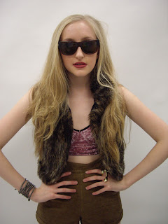
I chose this image to be my front cover image for many reasons. My models eye line falls on the top third to create direct address with the audience. And her hands on hips pose suggests she is confident, sure of herself. Her facial expressions further reinforce her undeniable confidence she has in herself and her music. She is the perfect role model for my readership.
She is wearing in trend clothes that signify the indie rock genre and are very in-trend. There is plenty of room around the image to fit my text (masthead, sell lines, cover lines, puffs, etc) 
Below are other shots from my photoshoot:


I really like this close up shot, however it doesn't showcase enough of the costume to be featured on my front cover; and the costume partly attracts my target audience. 


I haven't chosen this shot because it doesn't reinforce the artists confidence which wouldn't abide to my genre conventions. It also wouldn't stand out on the front cover as much as the image I have chosen. 


This image is most things I was aiming for in a front cover image. However her body language doesn't connote full confidence which I was aiming for. 
This is why I haven't chosen this image.  

Monday 14 February 2011

Colour Decisions

Colour Swatches


When I drew my flat plans I was unsure of what colours to use in my product. I sketched out a few different colour platettes to decide. 
I have chosen to use a 3 colour palette of hot pink, black and white. These colours compliment each other really well and signify the genre of indie rock. In my initial research NME had a similar colour palette on a front cover featuring Pete Doherty, emphasising on the hot pink colour. Whilst people may associate black as a dark emotive colour they show the seriousness of the magazine and on the other hand the hot pink suggests 'naughty but nice'. The white balances out these bright colours and adds classic clean style to the magazine. 

Wednesday 9 February 2011

First Draft of Article

‘YOU CAN’T WRITE SONGS WITHOUT DRUGS’
Thought Rosie Tyas had cleaned up for album number 3? Think again. Sophie Stratford heads to London to talk to her about her new album, The Optimist, recent successes and her thoughts on headlining the NME Awards Tour.
The golden pop phenomenon Rosie Tyas was first tipped for stardom when Group Love was released as a demo and since then she has risen to fame pretty quickly and her fan base has radically grown. She outlines what pure, raw, original music is really about, not manufactured or planned, it is entirely her own work.
She has just recently released her psychedelic new album The Optimist, she recorded the majority of it in Los Angeles with producer and musician Greg Wells, who also produced her debut album Group Love. The Optimist has a more mature sound than the previous albums, “I think Group Love and  Meds were albums that really introduced me as a solo artist but with the addition of The Optimist I sound more confident and, myself and the backing band have come on leaps and bounds, it is a pretty strong record. I love listening to it and I love playing the songs on it”. The album’s sound was influenced in many different ways, “I listen to a lot of music like The Smiths, Joy Division and New Order. Basically what interests me is two types of music, sincere and insincere so I have a mix. The album incorporated a lot of the new wave stuff that I love and a lot of elements of darkness and mystery. But mostly specific things in my life that were occurring at the time of writing and recording”.  When asked if there was a hidden story behind the critically acclaimed album, she commented “Well I wanted to have a title that was kind of like a movie title, something that makes you think outside of the box.”
Tyas’s stand out tracks on the album are “a song called Naked Kids which I really like because it has this happy sad theme and includes so much music from the 90s which I love. There is also a song called Toy Boy which is kind of delirious, it’s the creepiest fairytale on the record for sure. It talks about a boy whom expresses his life through the eyes of a doll and falls in love with the boy that owns him, but then gets broken hearted when the boy abandons him and the doll ends up being turned into a voodoo doll and lives the rest of his life underneath the sink in a cupboard and is telling everybody about how horrible his life has been.” Tyas’s first single from The Optimist, Millionaire, is a massively happy slice of timeless, sing-along indie-orchestral pop bliss, she chose this track to be a single from the album, “It is rhythmically and lyrically a lot of fun and it has this typical kind of teenage attitude in the lyrics, and I picked it as a single because it makes my feet move and I guess that’s a good sign” she says. Her music slightly differs from each album and all 3 have a different tone, she adds “Maybe people thought that The Optimist was going to be clean cut however it is actually more violent and more gothic. The sound has become a little bit more full of fantasy , I mean you can’t write songs without drugs”. Whether you believe Tyas’s depiction of her new album or not it is safe to say that this album is moving in a new direction.
Rosie Tyas embarks on a UK headline tour this March as part of the NME Awards Tour, she says “I’m definitely looking forward to the tour, it’s one of the biggest I’ve ever played. I love all of the other acts playing too and it will be great to tour with them. We’ve (Herself and the band) been practicing a lot and it is probably one of the best sets we’ve ever had, so it’s exciting. Our set will include about half of each album but we will be playing the “hits” or whatever you like to call them too of course”.
Tyas is driven by her desire for fame and love of performing, however I’m intrigued into how she knew that music was her forte, she says “When I was 12. I got my first job, I’d been kicked out of school, I didn’t have anything to do. I started to sing and became good very quickly and ended up with a gig. Then I realised there was another way of living your life where you weren’t treated like s**t and you actually had a responsibility to do something that you could be proud of. So it became my life and I realised that’s what I wanted to do.”
Tyas’s also reveals that even though she has finished dazzling album number 3 she has been working on some new material, “I’ve been working on songs and stuff for a movie, but I’m not really concerned about albums really. It’s all a bit everywhere, but in a good way though and I think I feel quite liberated.” Amongst her many successes of the year she is also nominated for a Brit Award – Best Alternative Female Solo Artist, up against the likes of Florence Welch and PJ Harvey “I am very chuffed to be nominated in my category especially with the other artists that are nominated, a lot of them I am a fan of. It’s a pleasure, I don’t know if I’ll win, probably not. However I like the nominations it’s like a little brat pack” She comments.  
What is the future for Rosie Tyas? “I don’t know. I know that I am going to continue to stay true to my fans and make music that is meaningful and interesting, and if my fan base grows or people forget about me I always just want to continue doing the same thing”. So, do you think Miss Tyas will clean up for album number four?
Rosie Tyas is headlining the NME Awards show this month, two win 2 VIP tickets for you and a friend visit www.indigo.com/competitions to enter.

Tuesday 8 February 2011

Article Planning

Article: 
My article is an interview with an indie alternative solo artist, named Rosie Tyas. It is about her new album, recent successes and about headlining the NME Awards Tour. The purpose of my article will be to entertain and inform. 

Style:
I will be using colloquial language using sophisticated terms with use of personal pronouns in order to suit my target audience. Words such as 'we' further engage the reader and make them feel more involved. 
Morphology is commonly used in articles featured in indie music magazines, using words such as blog, punklayered, uniqueness, unrelentless, indie-orchestral, hyperactive-drumming ect.
Lots of strong describing words are also commonly used such as, psychedelic, dazzling, explosions, melodies, pounding hooks, wildly , sky-scraping harmonies etc.

I will be incorporating all of these words into my article to make it as professional as possible.  

Numbers:
The full article/interview is usually between 700-900 words.There are about 150-200 words in an average paragraph, and about 8-10 words per line.


Before the start:
My title is 'You Can't Write Songs Without Drugs' this is edgy and controversial and will grab the readers attention and they will most likely go on to read the article. I will include an introduction that will briefly sum up what the interview is about, it will be something along the lines of 'Sophie Stratford talks to British solo artist Rosie Tyas about her new album (name), recent successes and her thoughts on headlining the NME Awards Tour'. And then go on to write a kicker paragraph to inform and hook readers further. 

Beginning:
My first paragraph needs to be interesting enough to encourage readers to read on. I will make the content important and interesting by using rhetorical questions, strong describing words and including new exclusive comments made by my solo artist, Rosie Tyas, that haven't been heard before. These first comments will intrigue the reader into reading the rest of the article as it will give them a hint that there is more to follow.

Structure:
As my article is an interview important and interesting content will flow right through the entire article. However more of the exciting questions, answers and information will feature at the beginning to hook the reader in. 

Ending:
I will end my article with a positive rhetorical question to make the reader think. This adds impact and asks the reader to think about what the future will hold for the artist. This question will also sum up the spirit of the article as this solo artist is doing very well in the music industry.

Extra text on the page:
A quote will be used, acting as a title, 'You Can't Write Songs Without Drugs', this is a direct relation to the artist.
I could use a playlist as this would be relevant for the content of my article as my artist has a new album out and is playing many live shows as well as headlining The NME Awards Tour. There will be a compeition at the end of the article to give readers a chance to win two free tickets to one of her live shows - they will just log on to the magazines website and respond online.

Monday 7 February 2011

Production Schedule

Week beginning 7th Feb. This week I am starting production on my magazine. I have a rough copy cut deadline on Wednesday 2nd March, therefore I must plan my time effectively. 


Article Planning - 8th Feb
Plan interview questions - 9th Feb 
First Draft Article/Research into article content - 2 X Lessons 9/10th Feb 
Photoshop Planning/Preparation - 11th Feb 


Front Cover Shoot in the Studio at Queen Elizabeth College - 11th Feb 
Front Cover Layout Construction/Content - 18th Feb - 21st Feb 
Front Cover Image Editing - 14th Feb 


Contents Shoot in the Studio and Garden - 8th Feb 
Contents Layout Construction/Content - 22nd Feb - 24th Feb
Contents Images Editing - 15th Feb 


Double Page Shoot at an abandoned Car Wash, Yarm Road - 12th Feb
Double Page Layout Construction/Content - 25th Feb - 28th Feb 
Double Page Image Editing - 17th Feb 

Tuesday 1 February 2011

Photoshoot Plans


There are great benefits of using the studio. It allows me to use high key lighting in order to light up my models face which is a main convention of indie rock magazines. Using the studio will also help me to create a more professional image and product. 

Reece of Location

The purpose of the visit is to decide upon the suitability of the location for shooting. I have commented upon the access to necessary facilities, assessment of potential lighting and or any potential issues with sound.

Reece of The Studio:


Location: Queen Elizabeth Sixth Form College, Darlington
Is it suitable – how? Why?: It is suitable because it has great photography equipment and is very accessible because the Studio is located at the College.
It allows me to use high key lighting in order to light up my models face which is a main convention of indie rock magazines. Using the studio will also help me to create a more professional image. 

Additional Comments / ObservationsI’ll have to arrange when my models are available to shoot, and I'll also have to book the studio.


Reece of the Abandoned Car Wash/Petrol Station:


Location: Yarm Road, Darlington
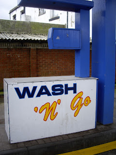
Is it suitable – how? Why?: This location is perfect for my magazine, it is typical for the indie genre and is very accessible as it's abandoned. It will give a rough grungy raw edge to the photo and the colours used (blue, yellow) are fresh so stand out. The location can also suggest personality traits of the artist and this can create a more personal link between the reader and artist. We will be shooting during the day creating a bright clear image.
Additional  Comments / Observations: I will have to check the weather forecast previous to when I'm going to arrange a shoot.


Reece of the garden:


Location: Sophie Stratford's garden, Middleton St George, Darlington
Is it suitable – how? Why?: It is very suitable as this is my back garden so is very accessible. We will be shooting during the day which will create a sharp, bright clear image that is typical of the indie alternative genre. The backdrop will be the decking, this makes sure that there are no distractions in the background and the viewer is focusing fully on the model/artist.
Additional  Comments / Observations:I will have to check the weather forecast previous to when I'm going to arrange a shoot.

Hazard & Risk Assessments


The Studio:


Garden:


Abandoned Car Wash/Petrol Station: 


Organising models: Call Sheets and Model Release Forms

Vicky Peacock

Rosie Tyas

Ryan Davies


Chris Stratford